Sarang Shukla
Unified Government Services
Increased user footfall by 60%, enhanced usability and accessibility to 70% by following the WCAG guidelines and UN standards. Redesigned government portal for Saudi Arabia as a part of Vision 2030, One-stop solution to all government services.

Case Introduction
The aim was to create an omni channel, avant grade, one stop solution, monolithic brand government experience to provide all government services with 100% accurate and latest information as a part of national development vision 2030 to increase the nations UN Ranking.
Project Vision
Introducing digital platforms while also keeping in mind user centric design practices, the regulations for government security services, personal data protection, and accessibility features according to UN standards. Creating best suited journey for both amateur and experienced user groups. Striking a balance between educating users and completing user journeys in minimum steps. A government experience must convey the feelings of security, trust, efficiency by empathising with users.
The Design Challange
The Ministry of Communications and Information Technology is responsible for all communication and information technology means in the Kingdom of Saudi Arabia, as well as setting development plans for the information and communications technology sector in the Kingdom
About Client
-
UX/UI Design + BA Support.
-
Established design system from scratch.
-
Conducting UX grooming session before the start of each sprint with development and testing team.
-
Assisting BA in writing acceptance criteria of user story.
-
UX Audit to make sure development meets the UX/UI standards prior to every client demo.
-
UX research , wire-framing, prototyping. Visual mockups following brand guidelines.
My Role
My Team
On Site Team
Saudi based researcher
MCIT Gov Engineering Team
1
4
3
1
1
Service Designer
UX/UI Lead (My Self)
Design Manager
UI Designer
Jr UX Designer
1
2
Off Shore Team
Mapping With Design Process


MATARIALISE
EXPLORE
UNDERSTAND
Empathise
Business Goal
& Requirenment
Problem
Statement
Stakeholder
Interview
Competitive
Benchmarking
Define
Information
Architecture
Pain Points
& User Aims
Persona and
user Journey
User Flow
& Task Flow
Ideate
Paper Sketch/
LowFie Wireframe
Highfie
Wireframe
Design
Iteration
User
Testing
Prototype
Functional
Prototype
Visual
Design
Design System
Visual Assets
Mockups / Design Documentation
Test
Design Iterations
for Improvements
Design
Discussion
User Testing
& AB Testing
Feedback
Analysis
Impliment
DevGromming Session
UX/UI Audit of Development
Development
Support
Design Asset
Preparation


Stakeholder Interview
I worked for 3 weeks from India and travelled to KSA to work closely with all the stakeholders, since it is a national portal it was tricky to pickup the right stakeholder to gather the information daily scrum meeting was one of the important platform to recognise the major stakeholders and to know the existing roadblocks. Other Interviews was done with project stakeholders, people from private agencies and product owners of other micro websites to understand the services and to establish a better collaborative understanding. I collaborated with UX researchers, Service Designers, Technical Architect and product owner
Kickstart Project
-
To bring +2500 government services under one roof,
-
Services are distributed over multiple micro websites, which belongs to different ministry and private agencies
-
user has to navigate through multiple micro websites to complete one services.
-
There is no single sign on.
-
Multiple payment gateway.
-
All micro sites looks different.
-
Poor information Archtitecture.
-
User has to search a lot to find a particular service.
-
Outdated information related to givernment policies and rules.
In the requirement document they have mentioned about having the session from top 4 UN ranking government portal, So, i considered them for competitive benchmarking
-
Estonia Government Portal www.eesti.ee/en/
-
Singapore Government Portal https://www.mom.gov.sg/
-
Norway Government Portal https://www.norg.no/en
-
UK Government Portal https://www.gov.uk
After having the basic project understanding i came up with below target areas to that caters problem areas came out during discussions
-
Templatization of all micro websites
-
Switching between websites with previous form data stored.
-
Single sign on with national ID.
-
Life event based services matrix.
-
Persona based service categorisation.
-
Single payment gateway.
-
Physical kiosk setup to all famous location around the country to attract and onboard usr base with national ID.
-
Dedicated smart search feature with tags like popular search and service recommendation based on search.
-
National Citizen - People of the nation looking for information and to avail any kind of government services.
-
Business - Individual and large scale business looking for the policies and services offered by the governemnt to support or open a business.
-
Expatriate - People looking for specific Services for Immigrants settled in the country.
-
Visitors - People come on tourist visa and looking for trustworthy source for information and services offered from government .
User Base
Interview was conducted by local researchers to identified personas based on user segmentations. 13 Personas was given to me, i studied the defined persona in order to know the user pain points, aims and what features can be derived to cater user needs.
After having discussion with all the stakeholder (Project Architect, Service Designer, Researchers and Engineering team) I defined below problem statement.
Background Research
Initial requirement was to uplift the UI and responsiveness of the existing government portal. A document with few screen shot was given to me as sitting in Inidia, i can not access website due to national security policies. So, I started with the heuristics evaluation and created UI concept and a basic IA based on the limited understanding and submitted the first draft of the document and scheduled a meeting for the design presentation and to trigger the further discussion to initiate the UX research.
Defining Persona
Defining Problems
Competitive Benchmarking
Proposed Solution
13 Persona was defined by the local user research team as 90% of the population does not speak english, Interviews were conducted in Arabic and later translated them into english for the UX design team.
Persona was based on User Segmentation as below:
-
Age Group
-
Professions
-
Life Stages
-
Primary and Secondary User
-
Physical Abilities
User
Persona

Services for business policy, licence, information about government policies and support for business etc.

Knowledge hub for visitor's about the services related to the national attractions and other benefits offered by the country.

Specific information about the rights and services for expats living in the country.

A life event based service matrix
for the citizen of the country.

GovX Service Categorisation
Service are mainly categorised based on majorly 4 user base.
360 degree coverage
service matrics

Research Team has shared the name of top 4 UN ranked government portal so i decided to study each of them to find out how they are presenting the information and services ans how they are addressing the UN guidelines to present information an data to the huge user base.
Competitive
Benchmarking


UK
ESTONIA
AUSTRALIA
SINGAPORE
Few glimps of Heuristics Evaluation
Benchmarking Output Matrix


Could lead to...
Smart search with search result Page
Assistive search with recommendations and most searched services.
Icons/images for better understanding.
Relatable infographics
Integrated chatbot with glossary and
feedback system.
Help and Support
Proper categorisation of services with daily use nomenclature
Well defined Information Architecture
Services bundled with the life stages.
Life event based services
Recognition rather than recall
Assist user with previously clicked service links to avoid confusion.
Accessibility features as per WCAG2.
Fully inclusive website
less and to the point information with upfront CTA's to avail services.
Reduced Cognitive load
User should be in control and has freedom to navigate back and forth.
Quick links and breadcrumbs
sign with email, phone or id number
Flexible sign in option
Benchmarking key Takeaway
-
Easy navigation and simple website
-
Building user trust with support & feedback system
-
Personalised Experience with life event based services.
-
Visual assistance in the form of icons and images
-
Instant access to all relatable services
-
Improved and tailored experience.
-
Less cognitive load.
-
Increases user loyalty



To make sure that the site’s information architecture is aligned with user expectations, I proposed card sorting sessions. i prepared +300 post it cards with service name on it,
Card Sorting
1. Open and closed card Sorting
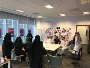
Around 128 people took participation and came to our office next day During the activity we arranged tea and snacks so they can feel comfortable. we divided them in 4 groups 2 for open card sorting and 2 for closed card sorting. Our goal was to categories services so that local people can find them easily.
Local researcher prepared a list of participant and they invite acquaintance and people from MCIT since we were working in the gov office it was easy to gather people from different age group and background.
2. Recruitment Process
-
After organising the data, we clearly defined main categories with 3 - 5 subcategories in each.
-
There were suggestion to change the nomenclature of the services as per the local people.
-
I updated the Information architecture after carefully analysing the result
4. The Result
3. The Activity
120 +
300+
4
User Groups
Service Cards
Participants


Information Architecture
I incorporated the findings from the card sorting activity and optimised and updated the IA to show case the post login and pree login high level structure of the portal.


I started with passport renewal service because during one of our discussion with project architect, he mentioned to complete passport renewal service user needs to navigate to different micro websites. that include multiple login and one of the pain point was to start service on one website and payment was happening on other website. So, I mapped the user journey and after few rounds of validations and stakeholders feedback we finalise the "To be" task flow.
User Flow


I started white boarding the initial wireframes and had internal brainstorming with my seniors and after couple of iteration i created few concept of landing page and presented the idea to design manager located in Saudi Arabia.
Wireframs


Landing Page
Search Page
Service Page
Service Catalog
Login


Post Login Experience
Responsiv

Responsiv


Navigation
Visual Design
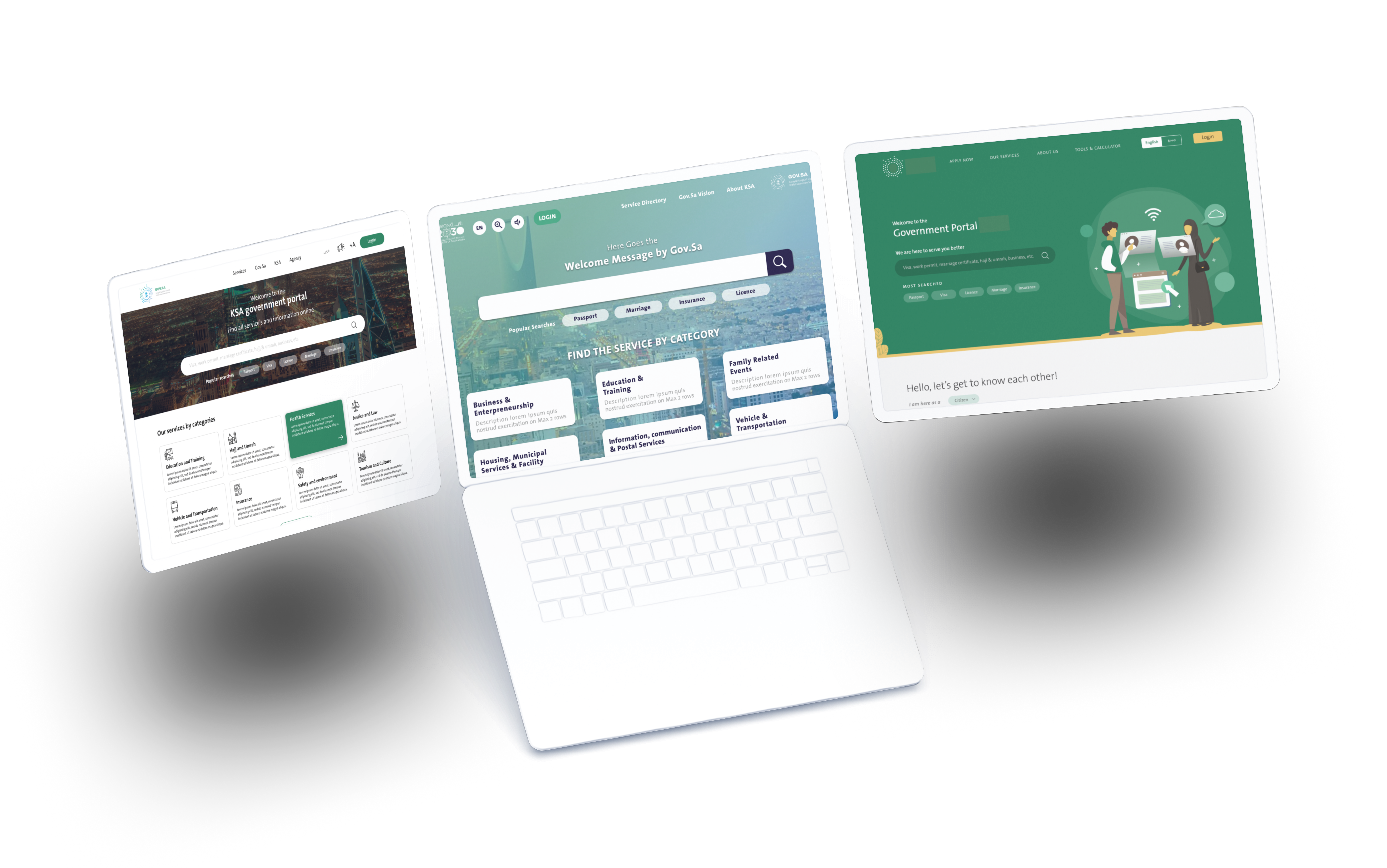
We created multiple options for landing page and finalised one after the AB testing with users


Usability Testing
-
Conducted AB Testing with the users for different landing page option to find out with what kind of design major user base empathise with and feel personalisation.
-
Prepared a set of task based scenario oriented questions to check what problems usr faces while completing a task.
1. Defining Tasks
2. Facilitate
4. Test Report
3. Observe
I prepared a set of task based question that covers major use cases to avail services offered by government portal.
Participants were briefed about the test and there screens activity were recorded with their consent . Scenarios were given to observe.
During the sessions navigation, user interaction with the application and their feeling about the visual option and were thoroughly observed.
Reports were generated from the tool chalk marker that consists of heat - map of user clicks, Included notes taken during the sessrioin about individual findings, observations, recommendation and the level of severity.
Usability Testing Process
Participant Segmentation
Saudi Citizen
Above 50
5
MCIT Employees
Work Force
Tech savvy
7
Young
11
UT Result
.png)
Age group (32 - 50)
-
Images help them to relate more with a sense of personalisation.
-
Official images increase trust and it represent culture & nation.
-
Numbers and pictures are easy to understand brings value.
65%
User Likes Images and pictograms
.png)
User emotions with the theme
-
Light colors are soothing to eye.
-
More focus on text and web elements.
-
Solid color background helps to reduce distraction.
-
Page is simple and crisp
User emotions with the theme
Age group (20 - 40)
User Likes Images and pictograms
35%


99% users jump on search
within 40 seconds when they
didnt find what they are looking for


90% clicked on primary category when shown upfront in the card.


Only 12% scrolls down on secondary level categorisation
to find services.


App To Control Eye Mask
A digital campaign to raise funds in-order to continue research and to build an eye-wear product which can cure seasonal affective disorder by improving sleep quality.
Website for marketing and raising funds to build the product.
B2C
2023
Product Design


